
Digital ecosystem
KAI Commuter
A design system for the website, the C-Access app, and the vending-machine interface so the user experience stays consistent.
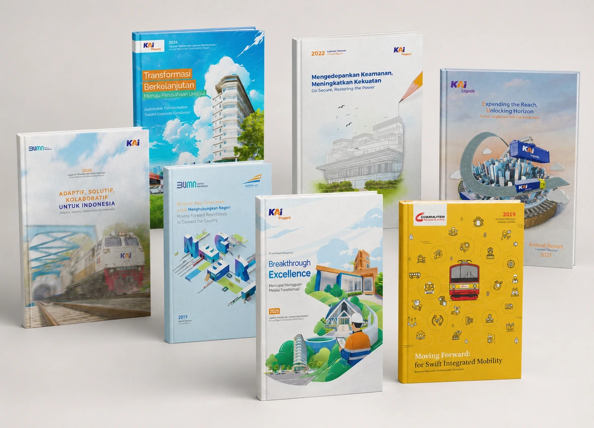
Context
Communication challenge
Unifying the public-service digital experience across several touchpoints so it stays easy to use, consistent, and trustworthy.
Approach
How this work was built
Every piece is built on an official-source principle: accurate, readable, consistent, and relevant to stakeholder needs.
Work steps
- Creating visual principles and UI components that apply across platforms.
- Keeping journey, transaction, and user-service information clear.
- Prioritizing readability, access speed, and experience consistency.
Dampak
Value for the company
The main impact lies not only in visual quality, but in the improved clarity, readability, and credibility of the company’s official source.
Intended outcomes
- The user experience becomes more consistent across the website, app, and service interfaces.
- Service information is easier for the public to understand.
- The service brand feels more organized and modern.
Related validation
Validasi pendekatan digital
Recognition and reviews that reinforce the context of this work.
Verified summary
1 million+ C-Access downloads, an adoption metric verifiable on the app store. Three unified platforms (web, app, kiosk).
Batas atribusi
The “1.2–1.4 million passengers/day” figure is the scale of KAI Commuter's service, not the result of our work. What we claim: app adoption and cross-channel experience consistency.
Consistent public experience
The design system keeps the user experience consistent across the website, app, and public-service interfaces.
Related validation is selected by client relevance, sector, work format, or type of communication impact. For client quotes, publishing on the detail page requires usage approval from the relevant party.
Diskusi strategis
Want to build work with similar impact?
Send us your annual report, sustainability report, corporate website, company profile, or reputation campaign needs. SAMCGI can set the right direction and scope.